UX Design Solution
A brief overview (for those of you who don’t want to scroll)
-
Women’s Health Research at Yale had multiple pages explaining how users could donate
-
Clarify the donation information, remove repetition, merge pages, improve user experience
-
Use Google Analytics, user interviews, personas, and journey mapping to define the problem and ideate solutions
-
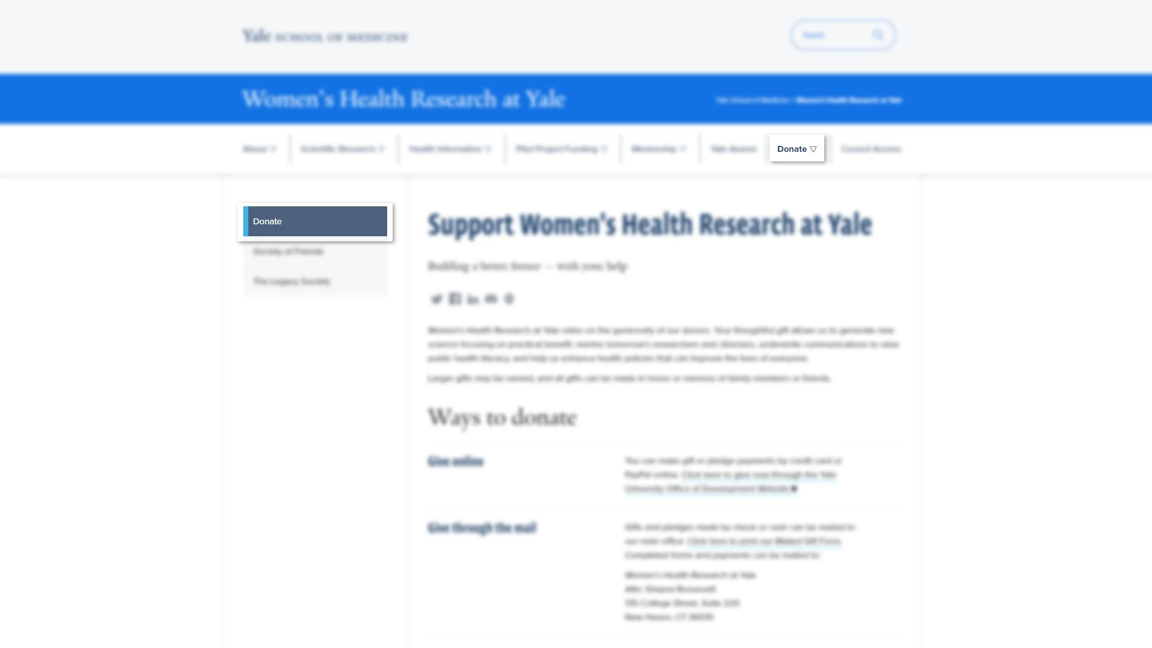
Merge 3 pages, simply text, change the navigation title from “Support WHRY” to “Donate”
-
Page views increased 20%, bounce rate decreased by 41%, and the average time on page increased 64%. Additionally, 39% of the page exits were due to clicks to “donate online.”
Since the implementation of these changes in December 2021, we’ve received 7% more online donations than in the previous period.
Background
Women’s Health Research at Yale created their website years ago. At the time of its conception, the system they used forced the editor to essentially build an entirely new page for anything they wanted to add to the site.
Since it’s creation, the content management system has changed and gone through several iterations. Due to the changes, the website ended up becoming quite large and overly complicated. Several pages were made that repeated similar information.
Due to the website having multiple pages dedicated to similar subjects, the user runs into issues finding the information they need quickly and efficiently. During my time at Yale, I have helped to improve the user experience by condensing several pages, clarifying the information presented, improving the visual layout, and creating a clearer hierarchy of information.
Problem
When looking at Google analytics and reviewing the websites user experience, I saw a clear trend within the users behavior flow that suggested confusion within the “Support WHRY” section. I observed that users would often click on support WHRY, and then continue to click back-and-forth between the other 2 pages, and often left the site after.
This suggested that the users were having a tough time understanding how they could donate quickly, where their money would be used, and how donating could benefit them. When I noticed this issue, I presented it to my manager, colleagues, and WHRY‘s Council, which consists of 20 major donor
Challenges & Goals
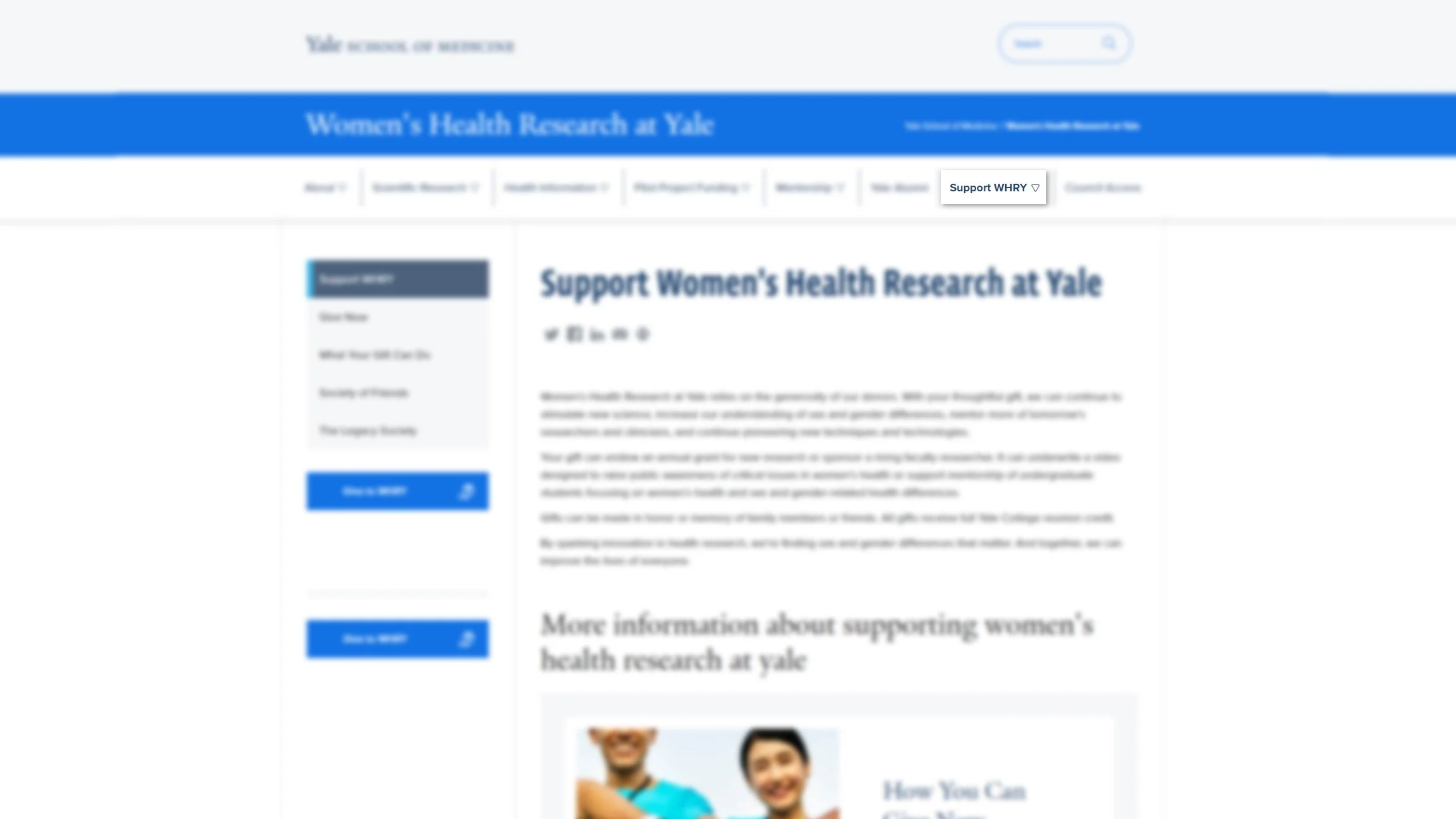
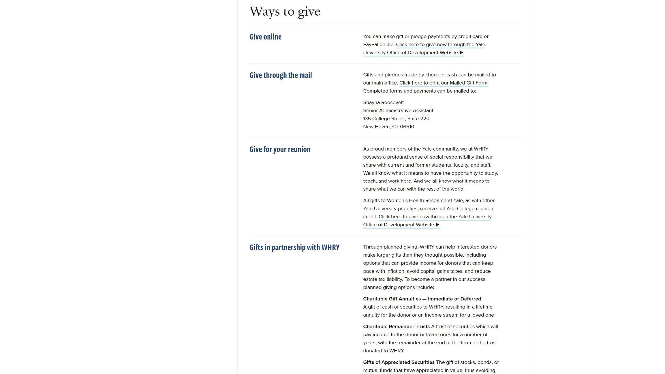
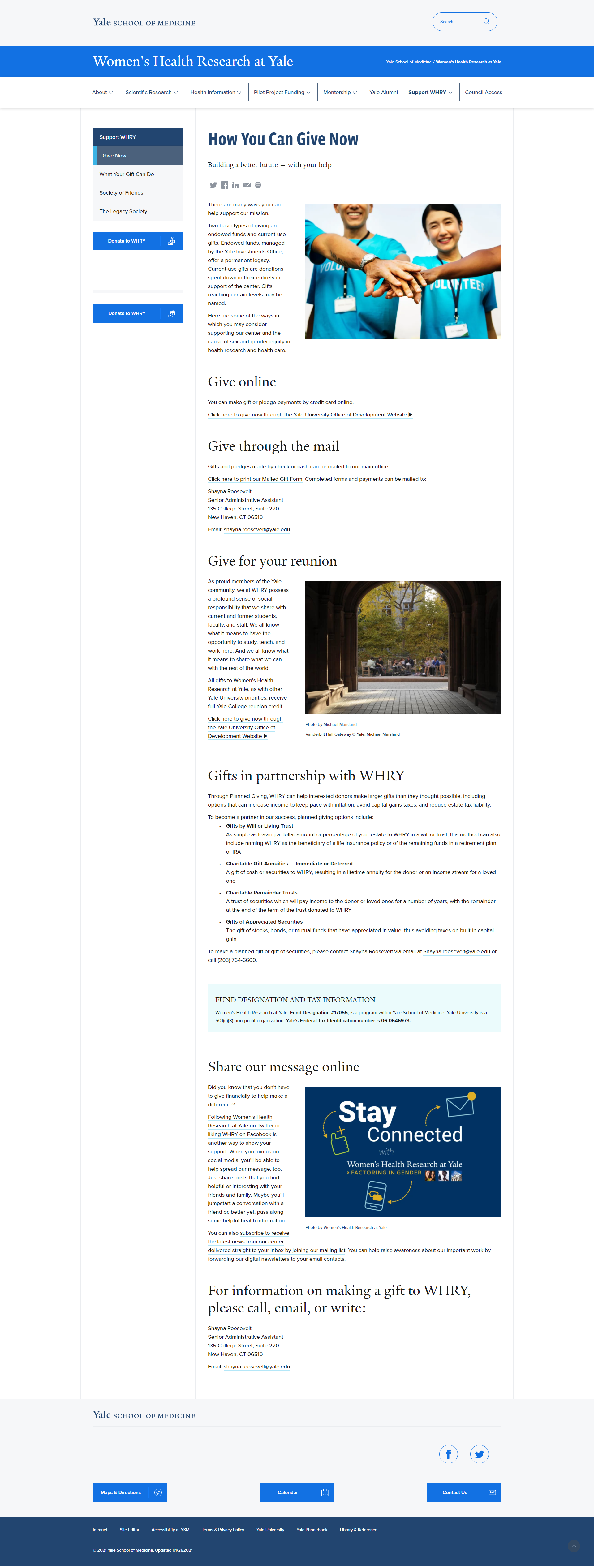
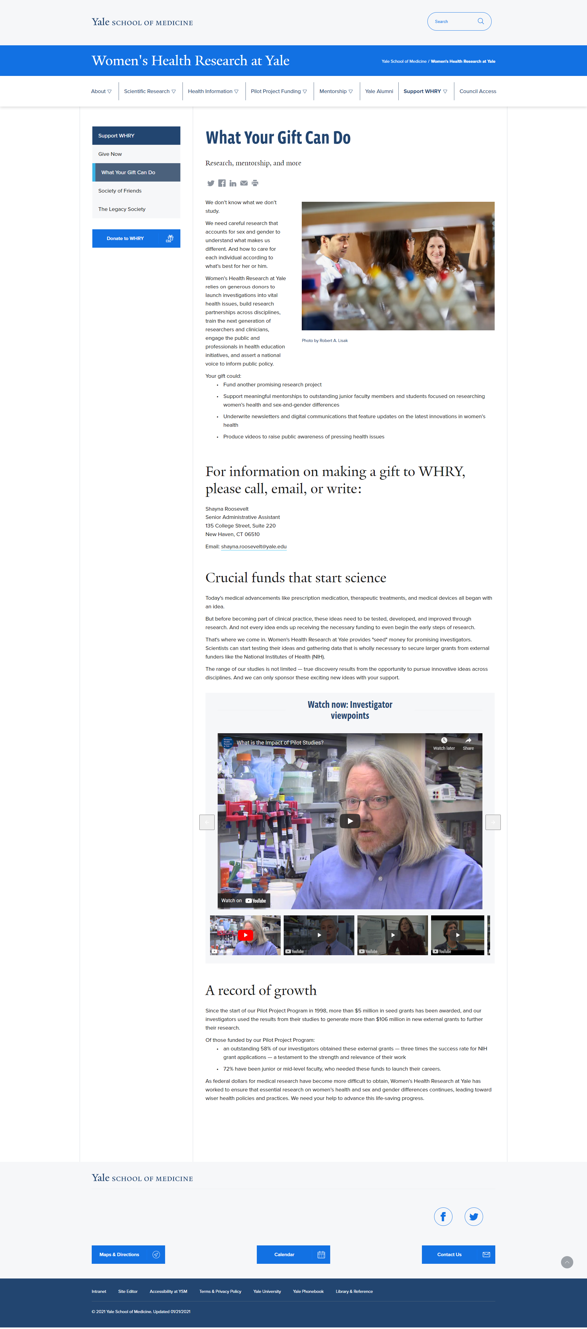
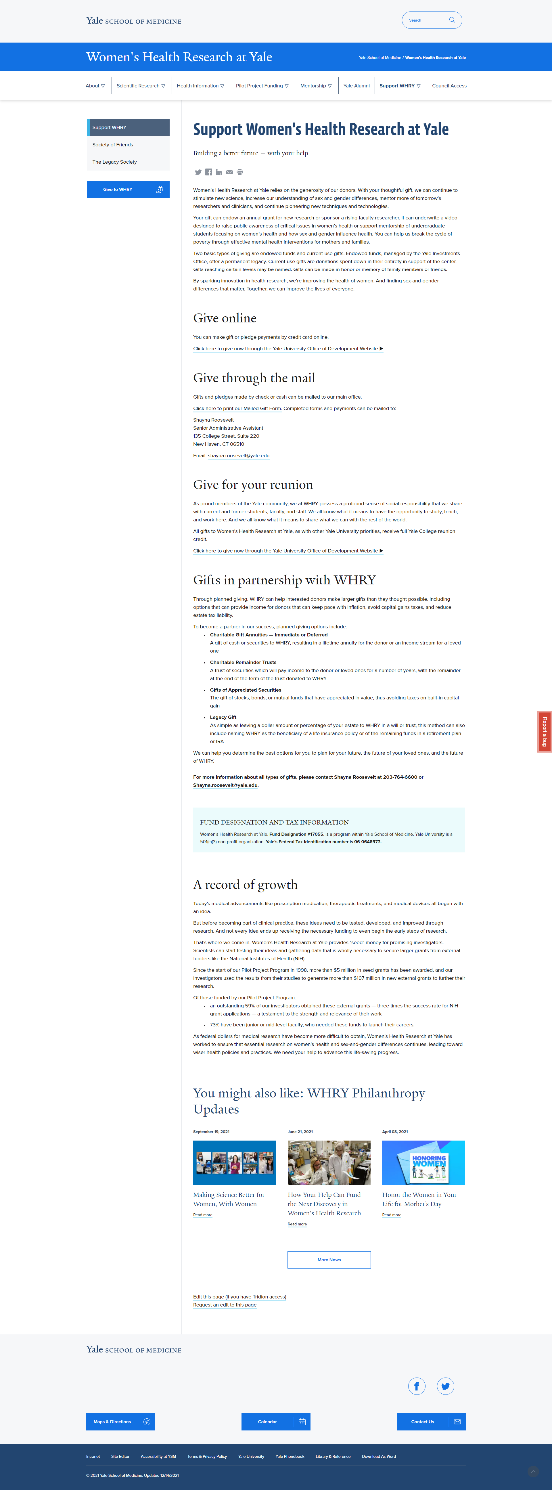
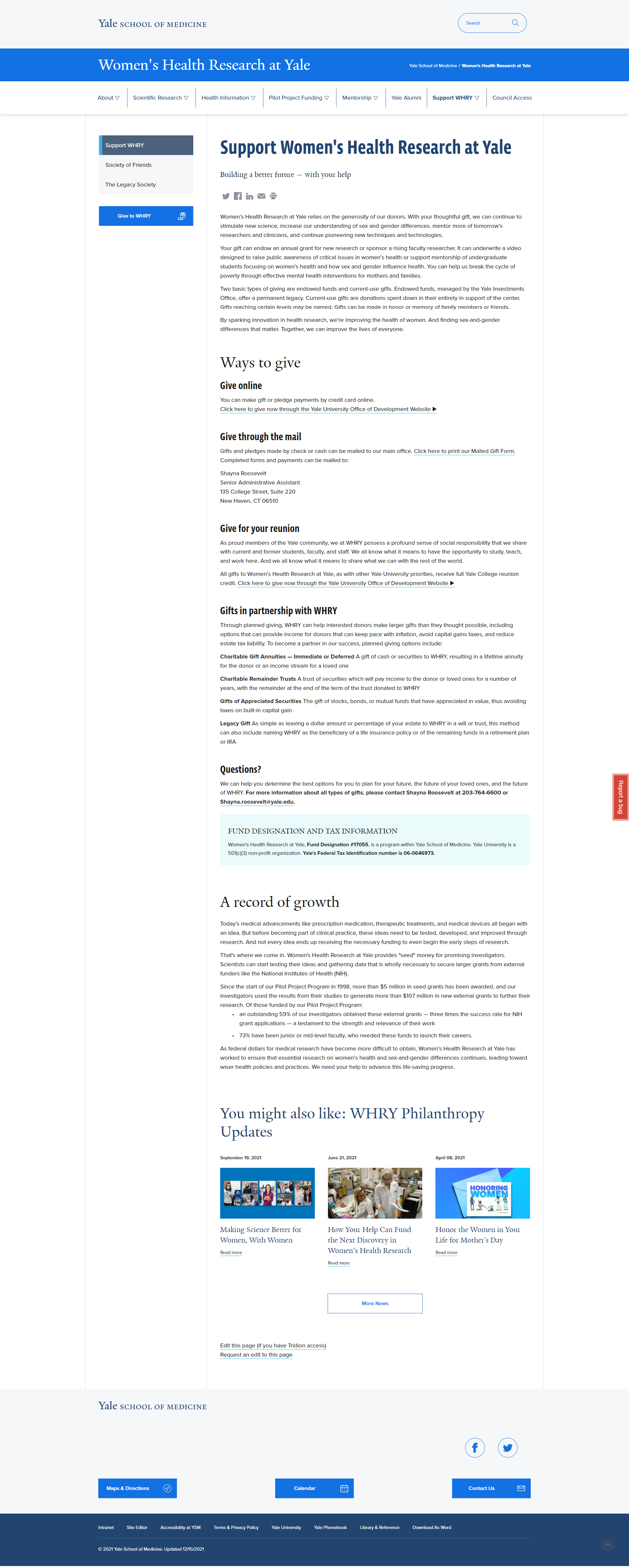
WHRY‘s “Support WHRY” section included three repetitive pages, titled:
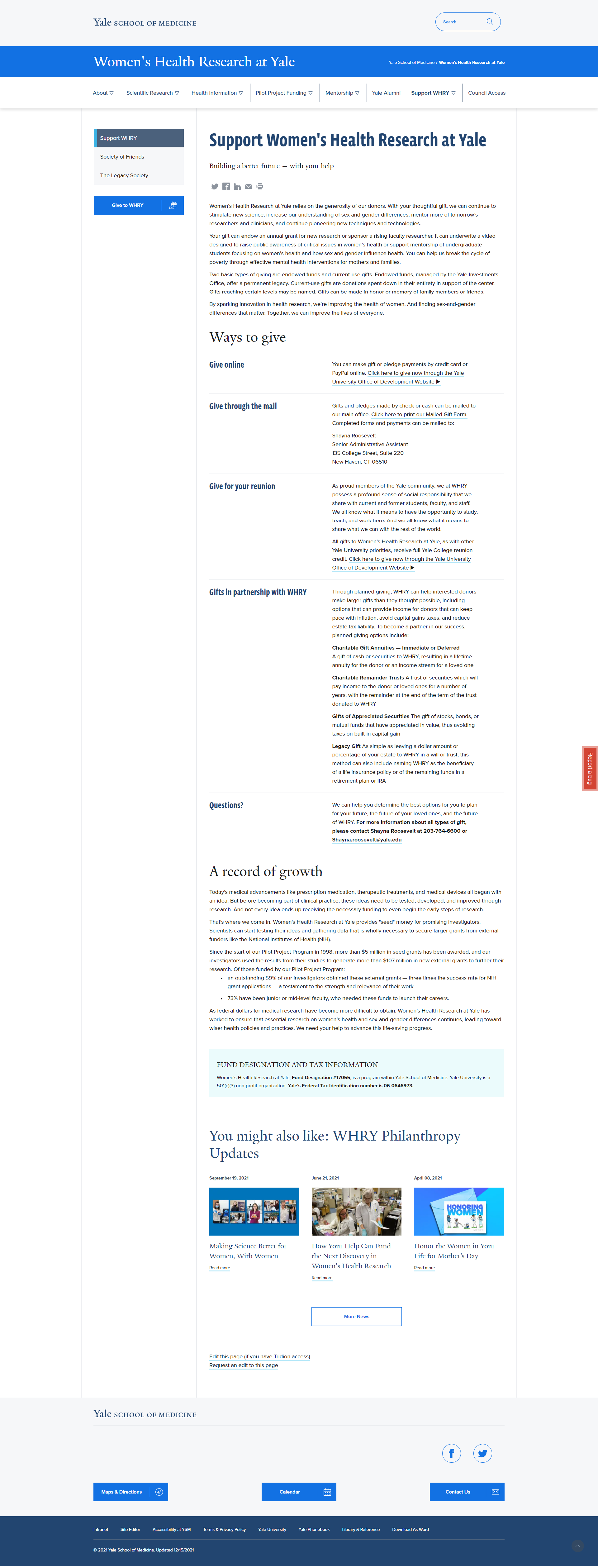
Support Women’s Health Research at Yale
How you can give now
What your gift can do
These three pages were intended to explain to the user how they could donate to WHRY, why their support is important, and how their money could be used. There were several problems with the section. Below are the challenges and associated goals for each problem area.
-
“Support WHRY” does not describe the information provided in that section as obvious as it could be.
Goal: Improve the navigation verbiage to better identify the content provided in the “Support” section.
-
Due to the repetition of information, it becomes confusing to the user looking for information on donating to the center. Excess and repetitive information causes frustration to the users and can result in losing potential donors
Goal: Improve the copy by clarifying information regarding the ways in which the user could choose to donate, what their money would support, how donating would benefit the user, and how their money could improve the lives of others.
-
As previously mentioned, the support section included 3 separate pages, all mentioning similar things and lacking clear instructions on how the users could donate.
Goal: Condense the number of pages for ease of use.
-
Through Google Analytics, it was clear that we were losing users in the process of them seeking out information regarding donations to the center, due to the poor user experience in this section.
Goal: Lower the bounce rate and improve user retention by making this section clear, easy to use, and easy to navigate.
-
Through Google Analytics, I could also see that 97% of the users were new users, whereas only 3% were returning users. We want our donors to keep coming back and hopefully, give more money to the center
-
Having to navigate through 3 pages to find out information that should be easily and readily available isn’t fun for anyone.
Goal: Improve usability by providing clearer navigation, clarifying copy, condensing information, and streamlining the way in which users could find what they were looking for. These changes should result in the user performing the tasks they set out to do so quickly and efficiently.
Overall, the goal of my work was to improve the user experience within this section by providing clarification of the content, reducing the number of pages, removing repetitive information, and creating ease of use through streamlining information. These goals support the business by assisting the user in the process of making a donation.
The intention of these goals are to help the user have an easier time navigating the site and get a better understanding of how they can donate quickly. If they can do this, they are more apt to stay on the website and this can result in an increased number of donations to the center.
Measuring Success
To measure the success of these goals, I would look for improvements in user retention, reduction in bounce rate, a simplified behavior flow, and an increase in online donations.
Timeline
Due to the nature of my work, I serve as more than just a user experience designer at the center. The timeline was longer than it would be for something of this nature, had that been my only focus. I set a timeline of two weeks for myself, which allowed me to perform my other tasks within this position.
Approach, Techniques & Skills
Google Analytics
To start, I gathered information to understand the problem further. Using Google Analytics, I analyzed our users behavior flow and took note of metrics including, page views, time on page, previous page path, and next page path.
User Interviews
I interviewed council members, students, staff, and users outside of WHRY on their experience using that section.
User Personas
Based on the information I gathered and knowing our key audiences, I created personas to identify the unique needs of our users.
Journey Map
I also created a user journey map to visualize the problem areas and frustrations of the users.
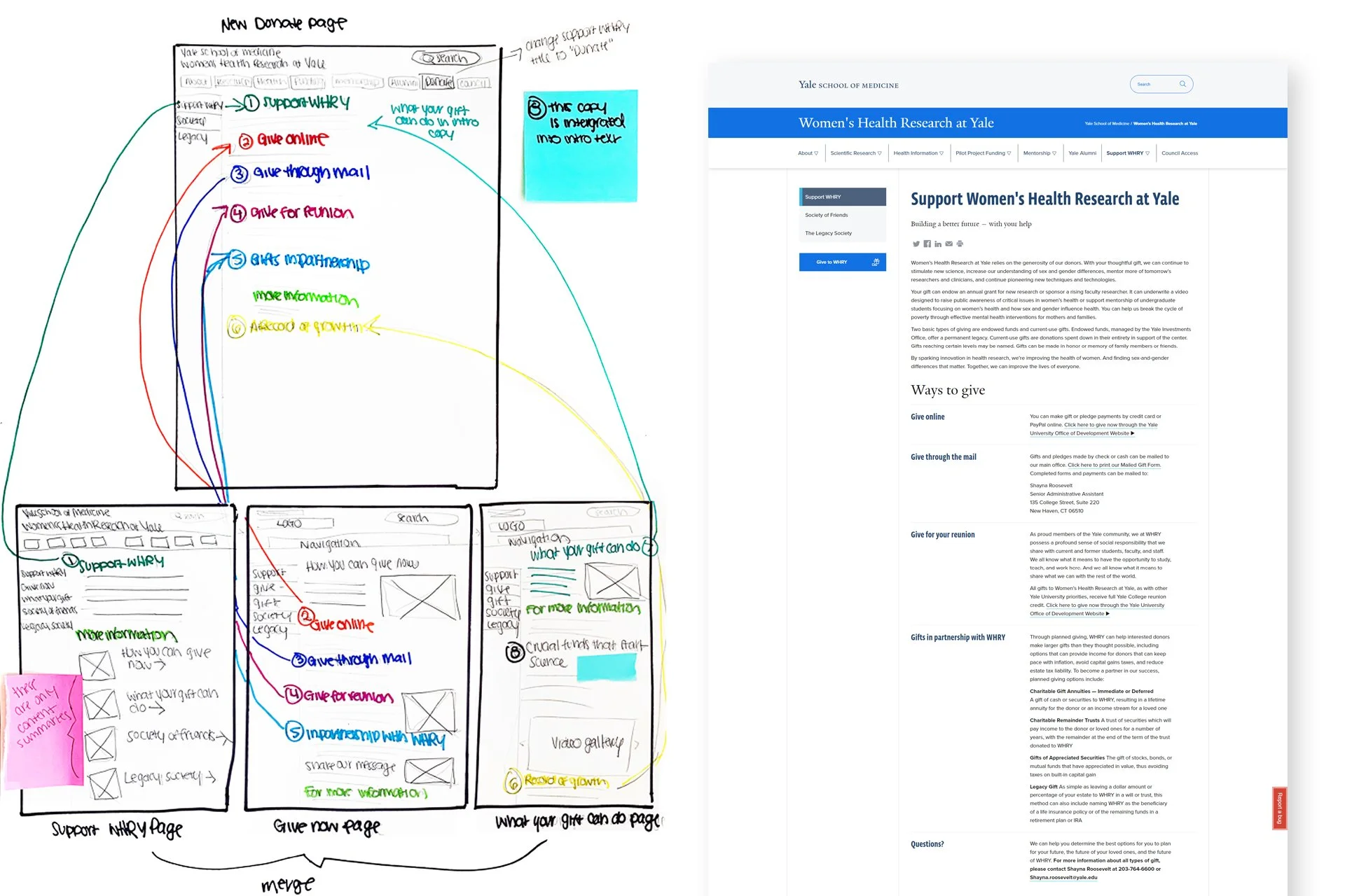
Design Process
Based on my findings, I began creating low and medium-fidelity mockups of the new features I wanted to integrate. I came up with several versions before I began a high-fidelity version.
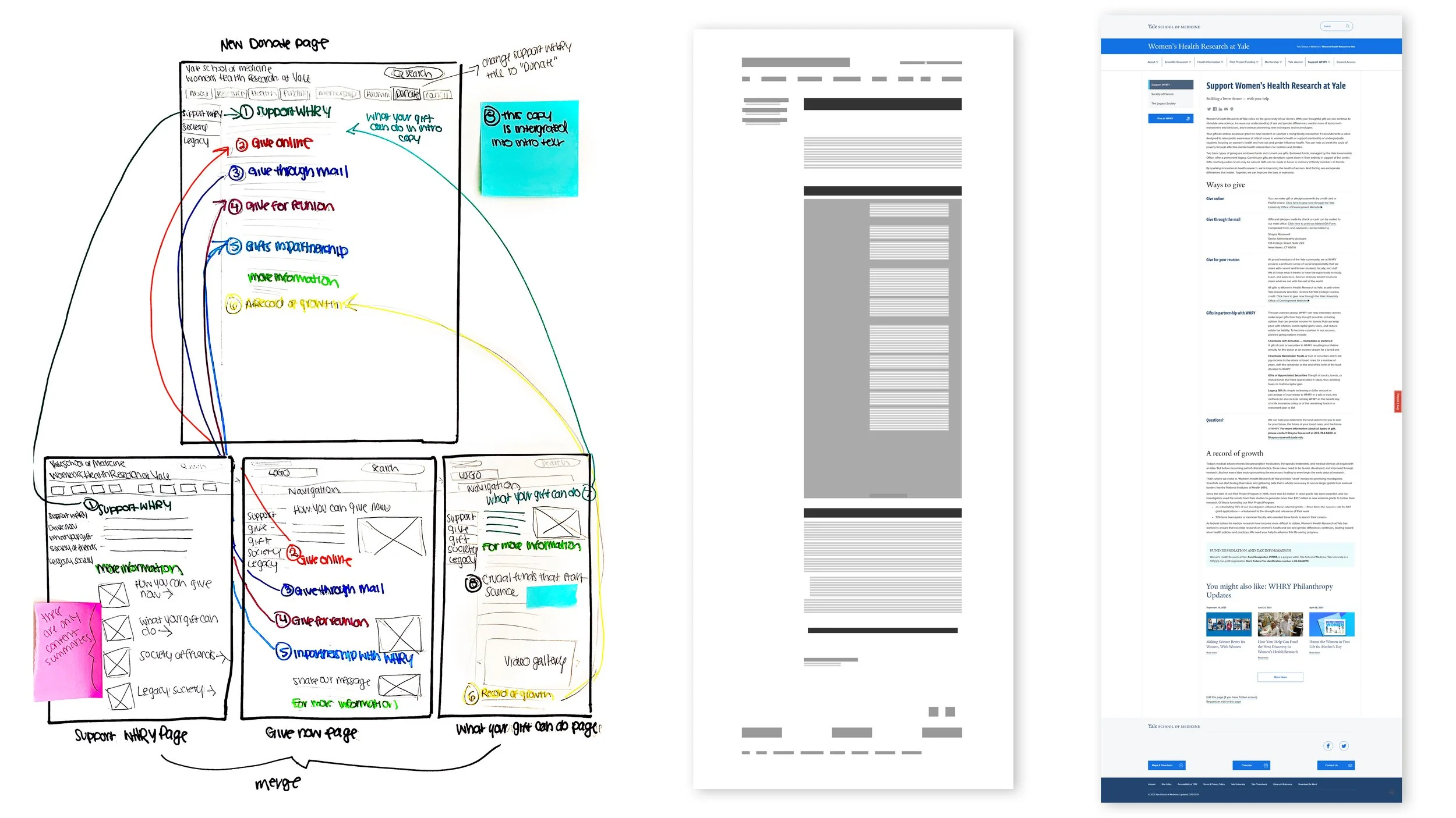
Original “Support WHRY” pages


Solutions
Navigation
Change “Support WHRY” to “Donate” for clarification
Clarity of Information
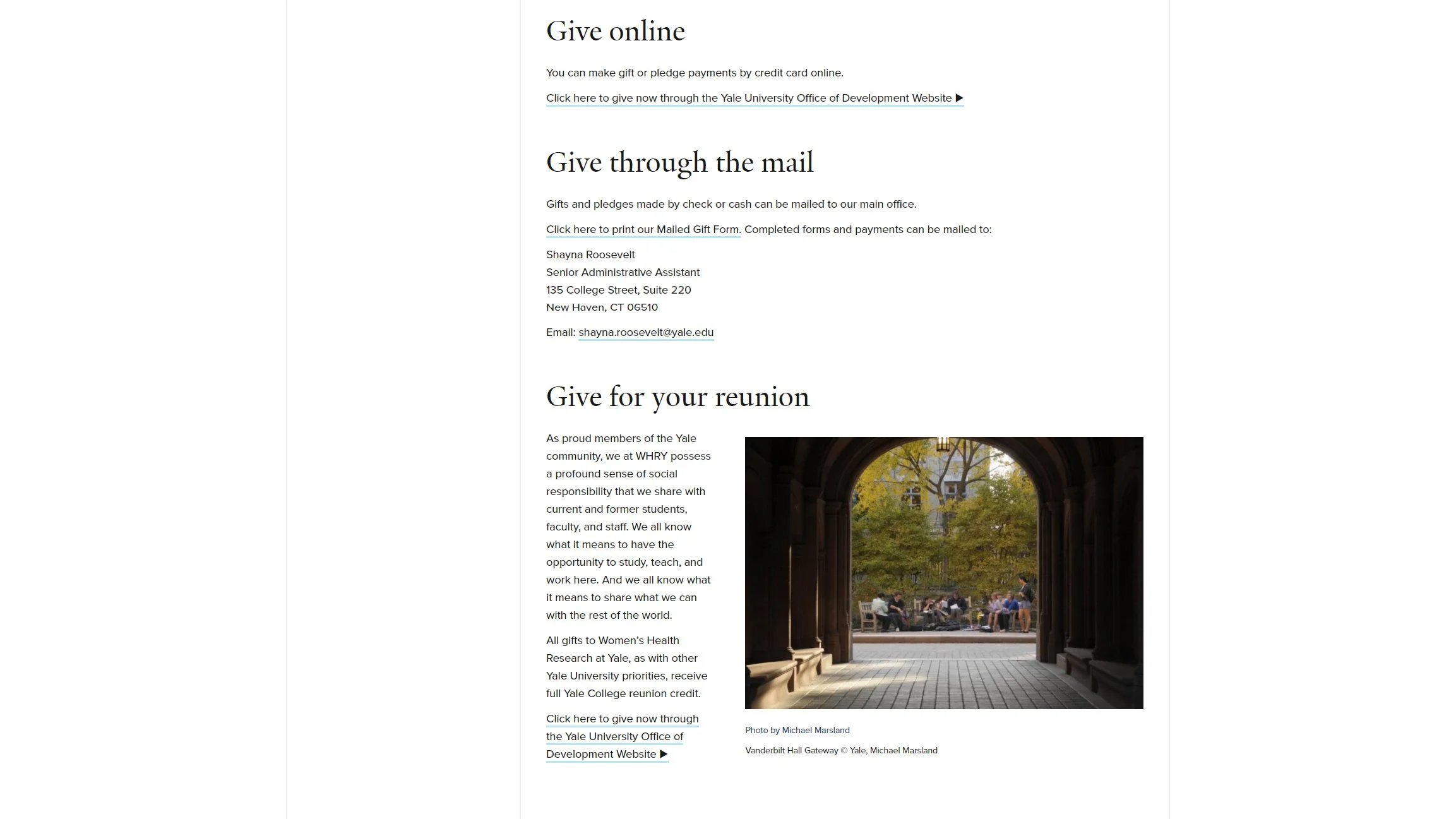
Worked with communications officer to clarify copy and improve directions for ways to donate, what their money would support, how donating would benefit the user, and how their money could improve the lives of others.
Formatted “Ways to Donate” in a way that was easier to scroll and scan
Removed unnecessary imagery
Remove repeated information


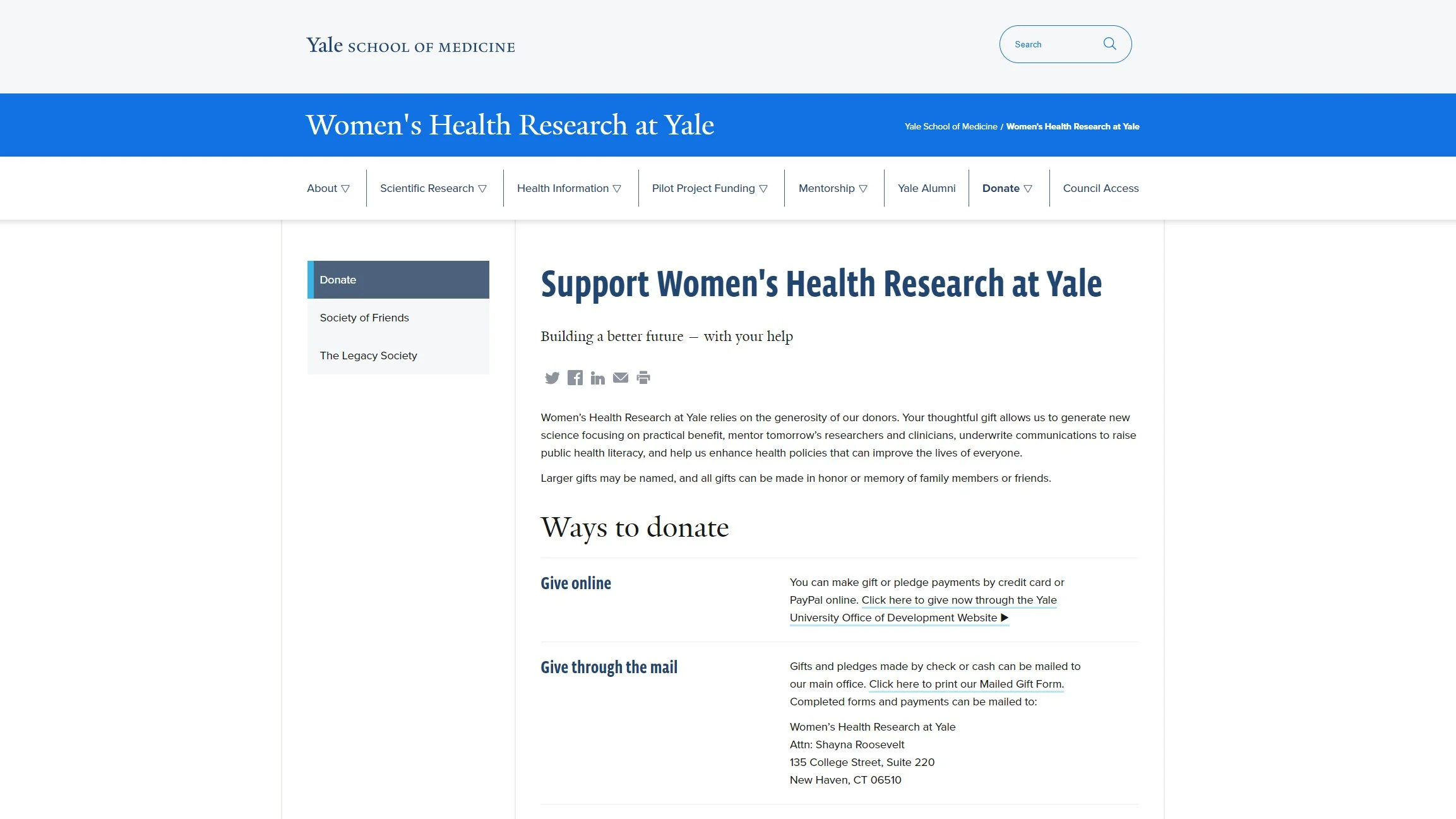
Number of pages
Merged “Support WHRY” “Give Now” and “What Your Gift Can Do” and replaced them with a condensed “Donate” page


Iterations
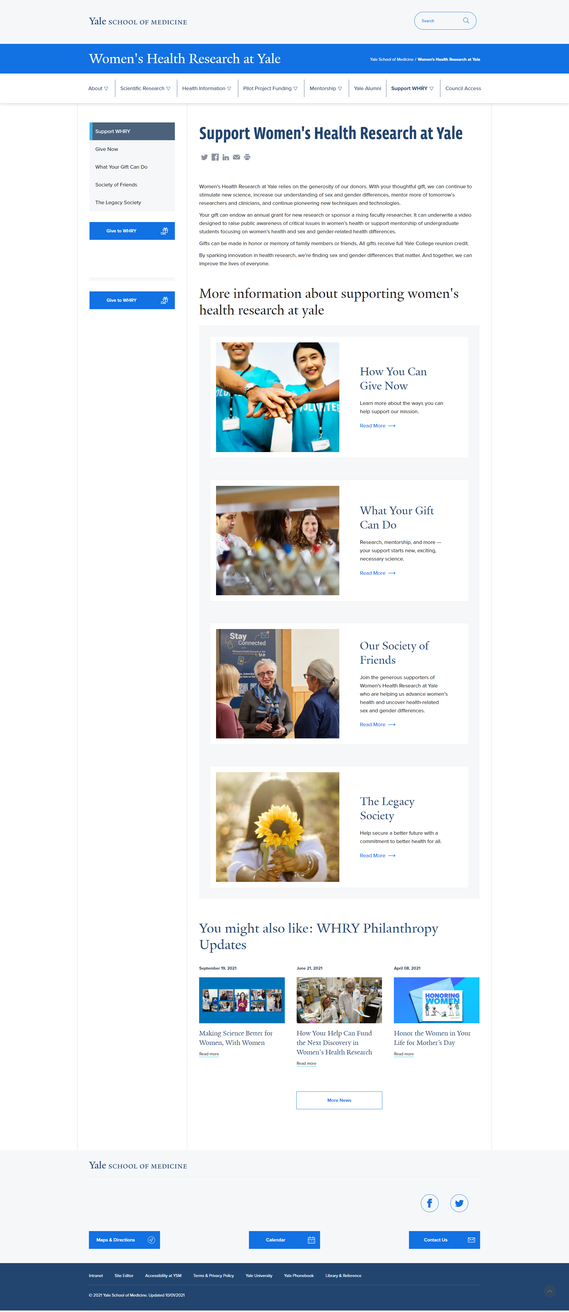
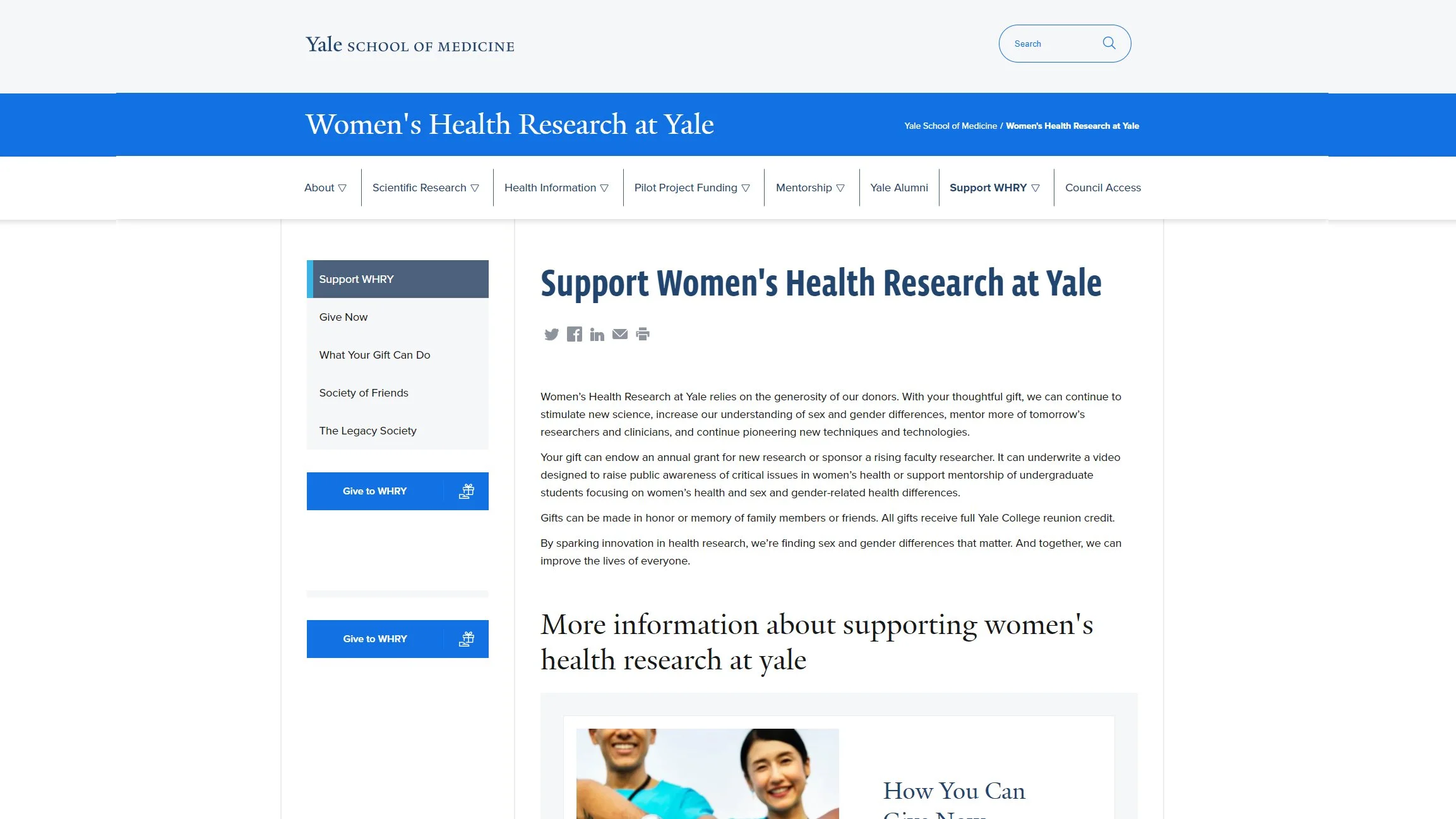
Before & After
*
Before & After *
Role & Collaboration
At WHRY, I am the sole UX Designer. My role for this project involved identifying the problem areas, empathizing with our users, gathering information to assist me in designing and ideating solutions; as well as implementing these changes, testing them, and measuring the results.
As for collaboration, I worked with our communications officer to simplify and clarify the text. He and I worked together on the copy. We then reviewed it with our accountant and other staff members for accuracy.
We also worked with the Director to make sure it fit her needs and business goals. Once the copy was agreed upon we also ran it by our council members.
Key findings
Through this project, I learned more about our users and demographics. I learned that 93% of our users on the “Support WHRY” section had been viewing the pages on desktop. This percentage is much higher than our overall percentage of users coming from desktop. On average, 57% come from desktop, and 43% visit from mobile.
To ensure this audiences need were met, I optimized the new Donate section for desktop usage, while also ensuring sure the mobile version looked and functioned well too.
Measurable outcomes
After implementing the changes. page views increased 20%, bounce rate decreased by 41%, and the average time on page increased 64%. Additionally, 39% of the page exits were due to clicks to “donate online.” Since the implementation of these changes in December 2021, we’ve received 7% more online donations than in the previous period.